

Recently in Innovation Category

You'll need a decent modern browser (Safari or Chrome) to see this:
http://bartaz.github.com/impress.js/#/overview
Enjoy!
No Comments
Flash had a bit of a hard time in 2010, and many will point the finger at Apple. When the iPad was released, consumers complained Flash didn't appear on the device, like its iOS sisters: the iPhone and iPod touch. Steve Jobs' Thoughts on Flash open letter cleverly spins the argument for not supporting the tech as a 'feature' as opposed to a 'hindrance'... in a "this is for your own good", kinda way.
They have now taken this one step further by shipping all new Macs without Flash pre-installed for Mac OS X - which started with the MacBook Air and now on all new Macs. Apple claim this is because users will not receive the latest version on initial install, and so have given them the "choice" to install Flash themselves, making it less, "Flash! Ahhhh!" and more, "Flash! Arrggh!"
Apple-cynics will argue that Jobs is dictating what technology us consumers are and are not 'allowed' to use. But cynic or evangelist, one would be forgiven for thinking Apple is trying to flush the technology completely. It raises many questions regarding the future of Adobe's adopted baby, and whether it is indeed obsolete...

These days web users are savvier than ever. Chances are that when you're surfing, you'll ignore banners and other online advertising so much that you hadn't even realised what they were trying to communicate - or possibly that they were even there. This, of course, makes the role of the online advertiser a lot more challenging.
Interactive banners are an attempt to stop this happening and catch the user's attention. They're capable of expanding, containing input fields or even interacting with the content within the page. And they're becoming more and more elaborate as their capabilities extend much further than an animated gif within a letterbox banner.

Today we're running lab-based user testing with our eye-tracking equipment. We have four participants booked to come in this afternoon and to run through a series of tasks comparing different homepage designs. Here's how a day of user testing breaks down.
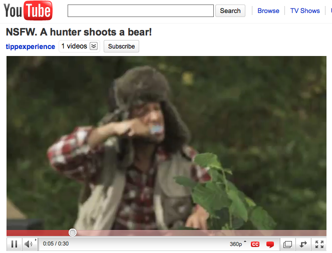
Cruising around online, I recently came across a website called Chatroulotte.
Created only last December by a 17 year old student in Moscow, Chatroulette pairs random strangers for webcam-based conversations. Visitors to the website randomly begin an online chat using video (with audio and text) with another visitor. At any time, either user may leave the current chat by initiating another random "spin."
And as with most new, unregulated and free internet technology, a lack of censorship and structure brings the worst "parts" of people to the fold, and my Macintosh screen.
However, once I was over the initial shock, many other aspects of the site really surprised and intrigued me - it was such an effective, exciting and seemingly simple idea.
I came across this "painfully honest" TV commercial.
It got me thinking about the approach most adverts take.
Being advertised to is a part of life,
deconstructing all these messages is second nature to everyone and because we know
we're being sold to, we digest adverts with a pinch of salt - obviously we're
only going to be presented with only the good points and benefits, obviously
the message with be slightly to extremely skewed.
That's why building trust is so important and difficult with a brand and why I found this Cullman Liquidation Mobile Home commercial so refreshing and exciting.
While the ad itself has neither high or low production values, the way it's presented and written is so honest I can't help but respect it, sit up and listen.
The question is, would I buy a mobile home if I was in the market for one and obviously had a modest budget?

This is not an Ikea blog. But the fact that these guys keep coming out with good ideas that use social media means that we will continue to talk about them. Saw this on Twitter recently and thought I would do my bit to spread it around the blogosphere.
It's basically a competition, but run over Facebook in a way that Facebook users would get excited about. And if Facebook users get excited about something, they tell others and that's the whole point about social media. You have to do things in a way that suits the users - not you.
Anyway, see the video. It's a cute idea.
Take a look at this TV commercial:
An advert using all the classic cinematic storytelling techniques - setting the scene, the build up, the tension, the twist, the reveal, with a bit of comedy and branding peppered in for good measure.
How important is it for an advert to entertain? And are these television commercials with immensely high production values wasting money and getting ahead of themselves?
3 Comments
Ikea Heights - Episode 5 from DaveAOK on Vimeo.
According to the people who posted it on Vimeo, Ikea Heights is a melodrama shot entirely in the Burbank California Ikea Store without the store knowing.
I'm still suspicious. What is the real reason behind this bizarre but fascinating little show? Here are some theories:
Theory #1: It really is something that Ikea employees, out of sheer love for their brand, started doing to show that Ikea is a brand full of personality.
Theory #2: It is something that Ikea employees did just for a laugh.
Theory #3: These were disgruntled Ikea employees, mocking the corporate brand and pouring scorn on the wholesome family values that Ikea subscribes to.
Theory #4: The whole thing is an elaborate marketing exercise, where hours of time and budget have been sunk into making it look amateurish and 'grass roots', in order to make the world believe in Theory #1.
Who can say?
Have to admit, I quite enjoyed it thought and the very fact that it has got people talking has got to be good for the brand in some way. Hasn't it?
See the rest of the series here.

The world around us is built on conventions, a common language made up by symbols, colours, shapes and actions. They reduce the amounts of friction in the everyday flow of life, minimise learning curves and ultimately increase productivity. Conventions definitely have their benefits, this is without any doubt in my mind.
As an interactive designer, my job is to take a problem, analyse its parameters, and then create a solution that ticks the right amount of boxes to achieve the desired results. Pretty straight-forward process really, although every day I find myself faced with the issue of "convention versus invention" when executing a concept or brief.
More often than not, a client will comment on something according to what they have seen or liked from one of their competitors, believing that this is the right way to go, is the current trend, and one which they are willing to follow. This is often a safe option that almost guarantees results and value for money, but how much value exactly?
When thinking about the design for a website for instance, sticking closely to the conventions may seem like a wise and tested route to take; logo top left, header, top navigation, brandbox, body, footer.
Boxes ticked?
Yes?
OK.
Next.
This website is going to serve it's purpose for the next 2 to 4 years, yet already it's old, recycled and repurposed. It's like releasing a 'best-of' album; sure, it's going to get added publicity for a limited amount of time, but 3 months down the line nobody is going to care much. They've heard it all before.
So what is this really showing about you as a company, or about me as a designer? Is this not showing that we are both lazy? Just taking elements from other designs and changing the colours or font sizes isn't going to distinguish us from the crowd. How much value am I adding? I respect that there are certain conventions that are in place that help solve the smaller, less trivial problems, but they should allow us move on to try solving the larger and higher impact ones that could very well make the difference and put our heads above the rest.
We don't have to re-invent the wheel, but stand out, change things and get some attention. We have to throw some great big tyres on it, and strap it to a Porsche-engined VW bug. It's called "progress."
And yes, you can have a 'Facebook' icon on your contact us page... rock on!