Recently in Design Category
You'll need a decent modern browser (Safari or Chrome) to see this:
http://bartaz.github.com/impress.js/#/overview
Enjoy!
No Comments
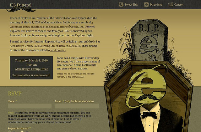
 Image from Majento
As a business, you’re going to want a really nice looking website, right? All the ease of use/navigation and a nice slick interface filled with animation and effects. Of course you do. We all do.
Forget your budget for a second and let’s say you get that site. The creative juices start flowing and the possibilities are almost endless. It’s going to be the best site ever. Finally it’s completed and you couldn’t be happier with the results. It shows just how cutting edge your business is. You might even say a cut above the rest. Excitedly, you go to show your decision-maker what he/she has paid for and-BAM-it looks awful. The formatting is ruined, the effects don’t work and subsequently, you cannot even navigate around.
How can this be? It looked GREAT on your machine. Then the penny drops - they’re viewing in Internet Explorer 6. So are most of your colleagues. So are many of your customers. You go back and have the site amended so it is compatible with IE6. Everything needs to be simplified, possibly even working from the ground up, and suddenly your site looks no better than that of your competitors…
But why is IE6 such a big issue for websites, and what can you do about it?
Wow - if you want a really poor user experience try using the Blackberry App store for the first time.
I have 2 phones, and iPhone for home and a Blackberry we use as a work support hotline. I decided today to check out the blackberry app store.
Now, you'd have though that Blackberry, being a little late on the app scene, would be trying hard to make their app store as successful as possible. I'm left feeling they actually don't want anyone to use it at all.
First up, no instructions for first time users.
Second, lots of messages about my OS being unsupported (*of course* i'm on a mac).
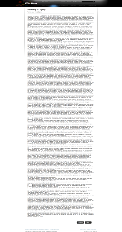
Third, when you click sign in you this:

Offputting or what?
I persevered (wondering if I've just signed away a kidney or something), then I was asked for both a ScreenName and a UserName - what's the difference? How many names do i need?It turned out my screen name needed to be a valid email address. So I entered one. Then it said it was invalid. It wasn't.
I gave up.
A client of ours has a large salesforce using Blackberrys. We are considering whether an App could be useful for them... but after this experience I wonder if anyone would even be able to download it in the first place?
Come on people at Blackberry, do you actually sign up yourselves? Has anyone noticed this mess?
No Comments
Download the latest Designers Block here
Why Designers Block?
Well, you've heard of writer's block? Well, designers get it, too - or something very similar. After all, although we may call ourselves 'creatives,' it doesn't mean we can be a conveyor belt of ideas for 365 days of the year. Sometimes it just won't happen, no matter how hard you force it.
I find the best way to overcome designer's block is to take a while to appreciate what has gone on before. Usually just enjoying someone else's work is enough to give me that 'lightbulb moment' of my own.
Which is why I started Designers Block, a collection of all the work that from one time or another has inspired me and opened my mind to brand new ways of working.
What can you expect to find in Designers Block?
Anything and everything, really: all different media, styles and brands. I'll look at print, online, mailers, business cards and guerrilla marketing, from right across the globe, in the realms of both B2B and B2C.
Want to feature in Designers Block?
If you have any design of your own that you would like me to feature in Designers Block, please email me.
Or maybe you've seen someone else's work which has inspired you? By all means, send that to me, too. I'm always looking to find out more about design and how others work.
It doesn't cost anything. It's just got to be good.
Download the Designers Block PDF
Not long ago, we created our new Base One business cards. And they’ve already been causing quite a stir - both online and offline.
First, a little background…
Forming part of the Believe campaign, the Base One business cards feature the B-Boys - two B-shaped textured characters designed and given life by one of our talented graphic designers, Dan Osman.
For those who don’t know much about the Believe campaign, the aim was to get people talking. What about? Well, their beliefs, specifically: the things they wish they could achieve, no matter how far-fetched.
And this is exactly what the business cards aimed to do. As well as providing obvious standout value with their unique interactive design, they aimed to get people talking about what makes them tick. After all, you can often learn a lot about a person just by finding out about just one of their beliefs, no matter how personal or impersonal.
How did the business cards do this? Well, when you get given one for the first time, the design invites you to lift the B-Boy out of its perforated holding. Once removed, a belief specific to the Base One employee who gave it to you is revealed. It may be that person says they would like to believe that England are destined to win the World Cup. They might like to believe that good things come to those who wait. They may even believe that cheese won’t make them fat. Whatever the belief, it’s a belief held by them that they’d like to share. And, ultimately, it gives the two people something to talk about and a reason to get to know each other better.
But the cards haven’t just got the recipients talking. The web’s already buzzing with Base One business-card-related banter. The design has already featured on a variety of well-known advertising and creative websites and blogs, including Ads of the World, I’m Just Creative, That’s Nice Design, Advert Lover, Creative Boom and It Even Has A Watermark. Who knows where they could end up next?
Understandably, we’re pretty chuffed. Our mission was to get people talking and we’d like to think we’ve been successful.
If you haven’t already, be sure to check out the I Would Like To Believe site where you can see other people’s beliefs and even post your own.
The world around us is built on conventions, a common language made up by symbols, colours, shapes and actions. They reduce the amounts of friction in the everyday flow of life, minimise learning curves and ultimately increase productivity. Conventions definitely have their benefits, this is without any doubt in my mind.
As an interactive designer, my job is to take a problem, analyse its parameters, and then create a solution that ticks the right amount of boxes to achieve the desired results. Pretty straight-forward process really, although every day I find myself faced with the issue of "convention versus invention" when executing a concept or brief.
More often than not, a client will comment on something according to what they have seen or liked from one of their competitors, believing that this is the right way to go, is the current trend, and one which they are willing to follow. This is often a safe option that almost guarantees results and value for money, but how much value exactly?
When thinking about the design for a website for instance, sticking closely to the conventions may seem like a wise and tested route to take; logo top left, header, top navigation, brandbox, body, footer.
Boxes ticked?
Yes?
OK.
Next.
This website is going to serve it's purpose for the next 2 to 4 years, yet already it's old, recycled and repurposed. It's like releasing a 'best-of' album; sure, it's going to get added publicity for a limited amount of time, but 3 months down the line nobody is going to care much. They've heard it all before.
So what is this really showing about you as a company, or about me as a designer? Is this not showing that we are both lazy? Just taking elements from other designs and changing the colours or font sizes isn't going to distinguish us from the crowd. How much value am I adding? I respect that there are certain conventions that are in place that help solve the smaller, less trivial problems, but they should allow us move on to try solving the larger and higher impact ones that could very well make the difference and put our heads above the rest.
We don't have to re-invent the wheel, but stand out, change things and get some attention. We have to throw some great big tyres on it, and strap it to a Porsche-engined VW bug. It's called "progress."
And yes, you can have a 'Facebook' icon on your contact us page... rock on!


