

Recently in Best Practice Category
No Comments
 Image from Majento
As a business, you’re going to want a really nice looking website, right? All the ease of use/navigation and a nice slick interface filled with animation and effects. Of course you do. We all do.
Forget your budget for a second and let’s say you get that site. The creative juices start flowing and the possibilities are almost endless. It’s going to be the best site ever. Finally it’s completed and you couldn’t be happier with the results. It shows just how cutting edge your business is. You might even say a cut above the rest. Excitedly, you go to show your decision-maker what he/she has paid for and-BAM-it looks awful. The formatting is ruined, the effects don’t work and subsequently, you cannot even navigate around.
How can this be? It looked GREAT on your machine. Then the penny drops - they’re viewing in Internet Explorer 6. So are most of your colleagues. So are many of your customers. You go back and have the site amended so it is compatible with IE6. Everything needs to be simplified, possibly even working from the ground up, and suddenly your site looks no better than that of your competitors…
But why is IE6 such a big issue for websites, and what can you do about it?

Wow - if you want a really poor user experience try using the Blackberry App store for the first time.
I have 2 phones, and iPhone for home and a Blackberry we use as a work support hotline. I decided today to check out the blackberry app store.
Now, you'd have though that Blackberry, being a little late on the app scene, would be trying hard to make their app store as successful as possible. I'm left feeling they actually don't want anyone to use it at all.
First up, no instructions for first time users.
Second, lots of messages about my OS being unsupported (*of course* i'm on a mac).
Third, when you click sign in you this:
Offputting or what?
I persevered (wondering if I've just signed away a kidney or something), then I was asked for both a ScreenName and a UserName - what's the difference? How many names do i need?It turned out my screen name needed to be a valid email address. So I entered one. Then it said it was invalid. It wasn't.
I gave up.
A client of ours has a large salesforce using Blackberrys. We are considering whether an App could be useful for them... but after this experience I wonder if anyone would even be able to download it in the first place?
Come on people at Blackberry, do you actually sign up yourselves? Has anyone noticed this mess?
1 Comment
Flash had a bit of a hard time in 2010, and many will point the finger at Apple. When the iPad was released, consumers complained Flash didn't appear on the device, like its iOS sisters: the iPhone and iPod touch. Steve Jobs' Thoughts on Flash open letter cleverly spins the argument for not supporting the tech as a 'feature' as opposed to a 'hindrance'... in a "this is for your own good", kinda way.
They have now taken this one step further by shipping all new Macs without Flash pre-installed for Mac OS X - which started with the MacBook Air and now on all new Macs. Apple claim this is because users will not receive the latest version on initial install, and so have given them the "choice" to install Flash themselves, making it less, "Flash! Ahhhh!" and more, "Flash! Arrggh!"
Apple-cynics will argue that Jobs is dictating what technology us consumers are and are not 'allowed' to use. But cynic or evangelist, one would be forgiven for thinking Apple is trying to flush the technology completely. It raises many questions regarding the future of Adobe's adopted baby, and whether it is indeed obsolete...

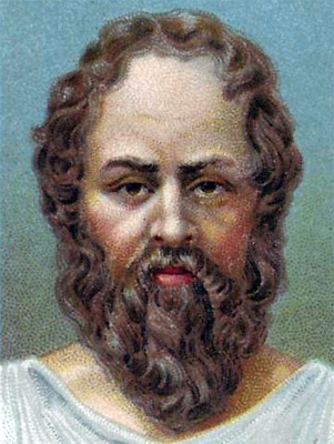
"Understanding a question is half an answer."
Socrates
Funny thing, briefs. Much maligned and rarely praised, yet they're the genesis of every unforgettable ad you've ever seen or heard. Good, bad, b2b or b2c, behind every ad you're sure to find one strutting proudly or lurking apologetically.
The first sandwich board guy proclaiming that the End is Nigh was even working to one (we've got to get the message across that the apocalypse is on its way, and we've got to use the most effective media to do it. Poster? Newspaper ad? Horse-drawn banner, maybe?)
Ideally, a great creative brief (as opposed to the bread-and-butter briefs essential to the day-to-day work of the agency) can involve every department - strategists, planners, account execs and creatives. There's a lot of effort that goes into one. So you'd think a lot of time should be invested in coming up with one. But we all know that that's not always possible. And when it comes down to it, a brief is only as good as the weakest link in the process - and there are a lot of links.
Inspired thinking? Or work order?
"Take a look at that brief on your desk today. How does it stack up?
Do you feel inspired by it, or is it more of a work order coming from the account and planning team?"
Howard Ibach
How to Write an Inspired Creative Brief
To appreciate what an inspirational creative brief looks like, I think we need to talk about what one of Howard Ibach's 'work order' briefs might look like first:
- It might fail to expand on the client's initial brief to the account team.
- It may take as its focus reams of product & background information in place of a clear message for the creatives to work from.
- It may have nothing unique or distinctive to say about the product or service & offer no insights.
- It may start the creatives off in the wrong direction with a weak insight, so that they waste time digging around to trying to discover what the real issue is.
- At its worst, a bad brief may just fail to inspire the creatives at all.
But how to inspire creative types when all you have is a list of product features? Try pictures. Videos. Maps. Anything to get them interested. But they do respond very well to emotive words.
Copywriting guru and rigorous thinker Howard Ibach has a lot of good stuff to say on what it takes to produce a great creative brief:
"A great creative brief should always be single-minded but never a straightjacket. The best creatives don't work to a brief. They work from it. Most of all...the creative brief needs to be like the work itself - bold, ambitious and creative. When it is, the brief becomes a springboard that drives creative people further. It should inspire as well as direct."
I like it. Brief as a springboard to an engaging creative solution that answers the client's problem. And if you believe Ibach (and I do):
"...a brief reduced right down to its core will most likely produce better results than a brief packed full of inane detail."
But what happens when you try to prise out a clear, single proposition from the multiple-message, high-volume, fast-turnaround and budget-constricted b2b machine?
Thinking with your gut
With all but the biggest b2b clients, a clear, single proposition can be difficult or impossible to achieve; the acute lack of time and budget militate the necessary research and strategy. And even then, a trusting, marketing-savvy client, a clear proposition, everyone firing on all cylinders and the time in which to do it all, need to be bundled into the mix to increase the chances of a great creative brief emerging.
It's not a hazard peculiar to b2b, but it is a common one. So if account teams are basing a brief on a single proposition, they need to rely on experience, gut feeling and intuitive guesswork. But we shouldn't always need to rely on gut instinct.
Enter Socrates
We can instead rely on a different method to determine the focus of the b2b creative brief. A bit of good old Socratic Method ; clear thinking and challenging accepted wisdom. Big fan of face-to-face discussion, was Socrates. Loved a chat. Great orator. Thing is, Socrates had a problem with the written word. And paintings. The trouble was, he told his student Plato, when you ask them a question, all you get in return is ...silence. And it's the same problem when a written brief plops on a creative's desk. You can't ask it a question.
b2b thinking
I'm guessing that to have the best chance of extracting a clear proposition or two from a b2b brief, Socrates would advocate some good old face time. Client, accounts, and creatives - asking questions of it. Exploring. Debating. Challenging it, to arrive at an agreed, shared vision of objective and proposition. And so no-one's toes are trodden upon, whoever is giving the brief needs to understand that the questioning is there to check the validity and strength of the conclusion - and not a threat or a challenge to them personally.
And once everyone's bought into it, I reckon Socrates would advocate another tenet of Socratic Method: if you think it's right, you should do it - no matter the consequences.
So take a long look at the next brief you have to work on and ask yourself: what would Socrates think?
Care to philosophise?
In an effort to instil even more rigour into our briefing process, we're planning on introducing some good old Socratic Method here at Base One. If there's any tips or tried and tested techniques you'd like to share with everyone on how to get the most from the briefing process, we'd be interested to hear what you're thinking.

I have a bone to pick with the people at BranchOut, the new Facebook-centred business network. But then I realised this is all part of a wider problem, which happens at different levels in different places on the social web.
What am I talking about?
Someone has stolen my voice.
That maybe sounds more sinister than it really it. But it's still bloody annoying when social media networks automatically post information 'as if' it is coming from you.
Can you imagine a company doing this in real life? This is how it would work. You go into a shop and express an interest in what they do. Usually, you might expect the proprietor to engage you, talk to you, maybe even remember you next time. But would you really expect himm to steal your mobile phone, impersonate your voice and ring all of your contacts in order to persuade them to also visit his shop?
This is what happened to me when I joined BranchOut. I joined because I saw that a couple of people I know and like had become members. So I signed up, but was unaware that it would automatically post a message on my Facebook wall saying how thrilled I was to be a new member.
I'm sorry, but you can't speak for me.
I might be happy about the prospect of connecting with thousands of people via their network, but you can't assume that. Moreover, you can't assume that I like it so much I want to 'auto-boast' about it.
But they did, by putting out the message below without telling me.
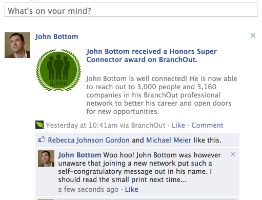
Maybe I didn't read the small print. And yes, yes - I understand that these messages are the way that BranchOut will, well, branch out. But if they annoy everyone as soon as they join, BranchOut won't go far. Social media networks enable people to connect - when and where they want them to. They don't force them to connect, and certainly not with words of their choosing! They may as well tie you down and stick pins in you until you agree to recommend them.
I could always open a new Twitter account called @BranchedOut and tell everyone that BranchOut is rubbish. If they can speak for me, why can't I speak for them?
OK - this is just one example. And I am sure the nice people behind BranchOut are not as rude as I am suggesting. But please, be more careful with the auto-posts. If you want people on your network, you've got to let them speak for themselves.

Why must we make things so difficult for our users? I can't tell you how many websites I look at that seem to be going out of their way to obfuscate what will happen when the user clicks on a link, button or navigational item. That moment of hesitation could be the trigger that makes your user leave your site for a competitor - and if they do that from your homepage then you've essentially prevented them from seeing what you have to offer.
Today we're running lab-based user testing with our eye-tracking equipment. We have four participants booked to come in this afternoon and to run through a series of tasks comparing different homepage designs. Here's how a day of user testing breaks down.


Last week I attended a one-day training course in “Writing For The Web”, as part of Nielsen Norman Group’s Usability Week, a six-day event covering all aspects of web usability issues.
As a copywriter with lots of experience writing offline material, I found it extremely worthwhile to find out more about the difference between online and offline copy and what makes words more accessible for an online audience.
Most of us use the web so regularly these days we’re probably aware of the conventions that are now commonplace on the web without consciously learning them. Most people would know where to find the navigation bar or the search field, or a rough word count for a homepage just by using the web every day. We’ve learned what to expect through osmosis.
As the web has developed and grown, these conventions have appeared for a reason. And, although it can be easy to ignore them because many boil down to common sense, you should still acknowledge these conventions to ensure you’re making your user experience as comfortable as possible for your audience.
So if you’re thinking about writing for a website any time soon, you may appreciate this guide, Words For The Web, that I compiled detailing some of the techniques covered on the Writing For The Web course.
Although the day gave a complete overview of usability, including writing for search, accessibility and how to organise content, (as a copywriter!) I’ve focused more on the writing style you should employ to ensure your readers find visiting your site informative - and enjoyable.
Download your free Words For The Web guide.

Now, I admit that I am a little behind in the world of mobile technology…being in the non-iPhone-owner minority - for which I am regularly sneered at, I might add. But I am up there in the world of Social media - I have a Facebook page, I’m on LinkedIn, I have a page on Twitter (which I’ll admit I don’t use) and I am a regular email and web user. However, I am wondering when and why the use of all of these combined became acceptable within meetings or formal situations?
It’s something that has been increasingly bugging me over the past few months. I realise, in this day and age where every second of business time is precious, that the use of mobile technology has enabled us to keep in touch with colleagues/clients whenever required - but how is it ok to continue this mobile communication within meetings? It used to be bad form to take your mobile phone into a meeting unless there was a specific, urgent requirement to have it there. It was certainly bad form not to have it on silent. But the iPhone seems to have made it ok for old fashioned etiquette to be thrown out of the window. It has become acceptable to respond to the beep of an email or text message in the middle of a meeting - it has become ok to pick up calls. At a recent conference (granted, the subject was the use of online communities within B2B marketing), delegates were ‘twittering’ throughout. Which was fine - they were interacting with people unable to attend. But I couldn’t understand how they could genuinely give the speakers their full attention - I also wondered how off-putting it was for speakers to be presenting to people glued to their phones. At this point, I might add that the delegate in front of me spent a large amount of time checking his emails throughout the conference.
Perhaps I need to move with the times - I realise that having everything - emails, phone, calendar in one handy device is convenient - I even think that the apps you can buy are cool, but I still don’t like the fact that the iPhone seems to be taking away manners. Unless it’s a matter of life or death, is it really a problem to leave it for an hour? After all, surely productivity levels and efficiency are being compromised because we’re trying to do too much, too often? Is there too much expectation to multi-multi task thanks to the technology available? I’d be really interested in your comments - do I just need to get with the times and accept that all forms of communication are acceptable at all times?
In my experience, Amazon is a great example of a site that makes improvements in increments. It's only when you think "ooh that was easy!" that you stop for a moment and realise they've made a change. This is a good way to update your site: visitors get the comfort and reassurance from a consistent user experience whilst you tweak problem areas. An additional benefit is that small, isolated changes can be more easily tracked to check that they really did make things better. You won't find a site owner that doesn't smile at proof of improved conversion rates or decreased exits.